Some service pages feel instantly comforting, gently guiding visitors forward. That comes from a thoughtful layout that keeps information easy, familiar, and stress-free to explore. When everything flows smoothly, trust builds naturally.
At Skinspire, we believe a great medspa service page is more than a pretty design. It should guide visitors through a clear, welcoming experience that helps them feel confident about booking. A strong aesthetic service page layout boosts conversions, builds trust, and helps people easily understand your treatments.
Skinspire has optimized hundreds of aesthetic websites across medspas, plastic surgery centers, and dermatology clinics. Our recommendations come from real performance data, patient behavior studies, and UX testing, not theory, so every layout choice supports measurable increases in conversions.
Let’s walk through how to create the perfect layout step by step and apply these tips to your own site or your clients’ pages with confidence.
Why Service Page Layout Matters?
Many clinics pour time into design but overlook layout. Design is the paint. Layout is the blueprint. Without the right structure, even the best design struggles to convert. At Skinspire, we help clinics go beyond surface-level design by teaching them how to shape service pages that guide visitors with clarity, intention, and trust. Our approach blends real user experience strategy with the practical steps found in writing treatment pages, giving clinics a stronger foundation for high-performing content.
A smart medspa service page structure helps readers:
- Understand what the treatment is and why it matters.
- Trust your clinic right away.
- See results through before-and-after photos.
- Know the risks, benefits, and who the treatment is for
- Decide their next step with a clear call-to-action
When your layout follows predictable patterns, visitors feel comfortable. They don’t get lost. They don’t feel overwhelmed. And they don’t click away.
Think of it like walking into a beautifully organized room. Everything has its place. Everything feels intentional. That’s the calm, guiding experience Skinspire aims to create for every clinic we support.
To strengthen SEO further, Skinspire recommends linking your service page to related content, such as treatment FAQs, your About page, and your Before/After gallery. These internal links help Google understand your site structure and improve how long visitors stay engaged.
Above-the-Fold Essentials
The top part of your page (the section visible before scrolling) is your clinic’s first impression. It’s your handshake, your warm smile, and your single biggest opportunity to reduce bounce rate. At Skinspire, we focus heavily on this area during our conversion optimization process because it sets the tone for the entire user experience. When the top section is structured correctly, visitors immediately feel informed, welcomed, and motivated to keep exploring.
A high-converting service page layout always places its most important elements right at the top, including:
1. A clear, friendly headline
Example: “Smooth, Radiant Skin Made Easy with Laser Resurfacing”
This sets expectations fast. No mystery. No confusion.
2. A brief, benefit-focused subheading
Explain in one sentence what the treatment does and why patients love it.
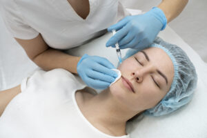
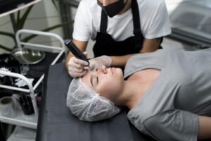
3. A welcoming hero image or video
Use real patient imagery when possible. People love seeing real results instead of stock photos.
4. One simple CTA button
Examples:
- “Book a Consultation”
- “Check Availability”
- “Start My Treatment Journey”
When writing your headline and subheading, include one core service keyword. For example, “laser resurfacing,” “chemical peel,” or “microneedling treatment.” This helps both patients and search engines immediately understand the page topic without sounding forced.
This area should feel calm and inviting. No clutter. No long paragraphs. No overwhelming text. Skinspire helps clients polish this first section so it guides visitors with clarity and purpose, turning that first glance into genuine interest.
Your goal here is simple: help visitors instantly understand where they are and what they can do next. With a strong, strategic layout, that becomes easy.
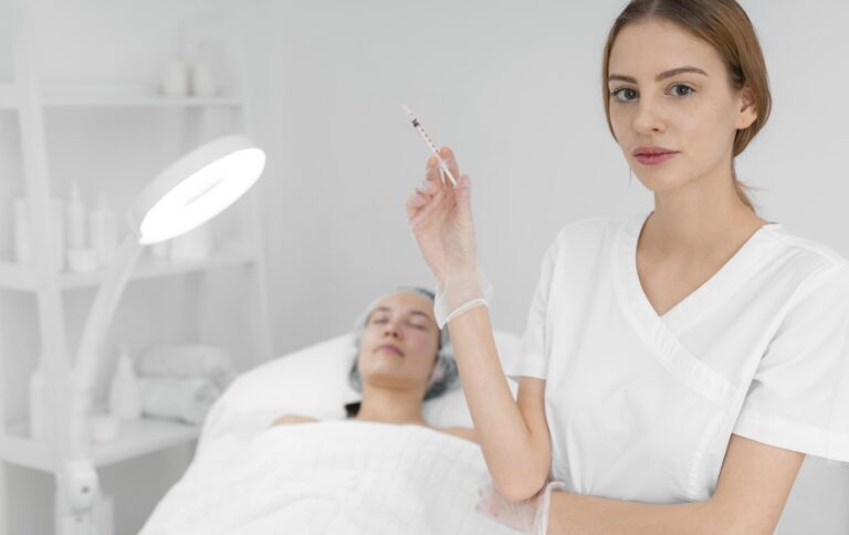
Visuals & Before/After Placement
Humans trust what they can see, and in the aesthetic industry, visuals hold more power than words ever could. That’s why Skinspire focuses heavily on helping clinics choose, organize, and present visuals that genuinely connect with visitors. Through our aesthetic SEO guide, we show clients how to use images and videos not just for beauty, but for credibility, storytelling, and higher conversions.
A perfect aesthetic service page layout uses visuals to tell a story:
- Before and after images were displayed early
Place them just under the fold so visitors see real results within seconds. This builds confidence right away. - Use a simple grid or carousel.
Make sure images are:- High resolution
- Consistent in lighting
- Clearly labeled
Skinspire helps clinics curate galleries that look clean, trustworthy, and easy to browse.
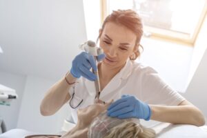
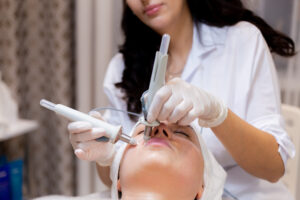
- Mix in short video clips
Videos can showcase:- The treatment process
- Practitioner expertise
- Patient transformations
- Behind-the-scenes moments
These small clips add warmth and personality, helping viewers feel more connected to your clinic.
- Keep visuals honest
Avoid heavy editing or unrealistic results. Authentic visuals build trust faster than anything else.
Before uploading any image, rename the file using a descriptive phrase such as “laser-resurfacing-before-after.jpg.” Add natural alt text like “patient before and after laser resurfacing treatment.” These small steps improve accessibility and help your visuals rank in Google Images.
Think of visuals as your proof of excellence. When visitors can picture their own transformation through real images and authentic moments, they’re already halfway to booking, and Skinspire ensures every visual on your page supports that journey with confidence and clarity.
Trust Elements Patients Look For
Trust is key in aesthetic medicine, especially when shaping a strong foundation for cosmetic treatment page design. This is where many competitors fall short. They show the treatment but not the people behind it, and they highlight benefits while skipping the safety facts. Skinspire helps clinics understand how to structure aesthetic service pages in a way that showcases credibility upfront, so patients feel reassured from the moment they start reading.
When describing your treatment or practitioners, naturally incorporate your city name once. For example, “performed by licensed providers here in [City].” This simple addition strengthens local SEO signals without affecting readability.
Here’s how to build trust with kindness, clarity, and confidence, core pieces of the best layout for cosmetic treatment pages, especially when following medspa landing page best practices:
- Practitioner Credentials
Show who performs the treatment. Add photos, certifications, and short bios. Friendly introductions help people feel connected. - Awards, Badges, and Health Compliance
These act like gold stars for adults. They show professionalism without saying a word. - Testimonials and Patient Stories
Place a few short, cheerful quotes near the top, then add a longer testimonial section lower on the page. Real voices make your page come alive and reinforce authenticity.
Treatment Details Structure
Your treatment information should feel like a friendly guide—clear, warm, and easy to follow. At Skinspire, we help clinics shape this section using proven strategies from our CRO resources, making sure every detail supports clarity, trust, and stronger conversions. When your information is simple to scan and written with care, visitors feel supported rather than overwhelmed.
Here’s a simple structure that works for any cosmetic treatment page design:
- What the Treatment Is
Explain it as if you’re talking to a friend. Keep the language simple and avoid medical jargon unless you take a moment to explain it. - How It Works
Use easy descriptions and friendly comparisons. For example:
“This treatment works like a gentle reboot for your skin cells.” - Benefits
Use bullet points to make results quick to understand. Focus on what patients truly care about, like smoother skin, fewer lines, or a brighter complexion. - Who the Treatment Is For
Help readers imagine themselves by describing the ideal candidates in a hopeful and encouraging tone. - What to Expect During the Procedure
Guide them through the steps so they know exactly what will happen. Clear explanations reduce uncertainty and boost comfort. - Aftercare and Recovery
Be reassuring and honest. People appreciate knowing how long results last, what healing looks like, and how simple recovery can be. - Risks and Considerations
Share possible side effects with calm, straightforward language. Transparency builds far more trust than overselling.
Quick Answers Patients Look For
Patients often hesitate because they can’t quickly find simple answers. Add 3–4 micro-FAQs like:
- Does this treatment hurt?
- How long does the appointment take?
- What results should I expect in the first week?
- Is there downtime involved?
These lighten cognitive load and reduce pre-booking anxiety.
When visitors understand everything in a calm, organized way, they feel confident and ready to take action. With Skinspire’s support and the right CRO practices, your treatment pages become clear, welcoming, and conversion-ready.
CTA Strategy & Placement
CTAs are the magic buttons that turn visitors into patients. However, too many can feel desperate, while too few can leave opportunities on the table.
Here’s a friendly rule of thumb for high-converting service page layout:
Place a CTA every 2–3 sections
People don’t always scroll back up. Make it easy for them to convert wherever they are on the page.
Use warm, inviting language
Examples:
- “Let’s Plan Your Glow-Up”
- “Reserve Your Spot”
- “Say Hello to Your New Skin”
Keep CTAs consistent
Use one main action, like booking a consultation, so you don’t confuse people.
Add a soft CTA too
Examples:
- “Learn More About This Treatment”
- “See More Patient Results”
Soft CTAs help visitors who are still exploring rather than ready to book.
If your service page is longer than 1,200 words, include a mid-page CTA, placed immediately after the Before/After gallery or “How It Works” section. This captures visitors who are already convinced and prevents drop-offs.
SEO Considerations
Search engines love pages that help people. A great layout supports strong SEO by organizing information logically and keeping readers engaged.
Here’s how to optimize your medspa landing page without keyword stuffing:
1. Use your main keyword in key places
Such as:
- Title
- Introduction
- One or two headings
- Conclusion
This tells search engines what the page is about while keeping the writing natural.
2. Keep your structure clean
Search engines prefer clear sections with H2 and H3 tags.
3. Add internal links
Helpful internal links include pages like:
- Writing Treatment Pages
- Conversion Optimization
- Aesthetic SEO Guide
- CRO Resources
These help readers explore more topics and boost your site’s authority.
4. Use descriptive alt text
Describe images naturally to support accessibility and SEO.
5. Aim for around 1,500 words or more
Longer content keeps readers engaged and sends positive signals to search engines.
Example Layout Framework
Below is a simple wireframe-style layout you can follow. Feel free to picture it as a long-scrolling page, since that format performs extremely well in aesthetic marketing.
ABOVE THE FOLD
- Headline
- Subheading
- Hero photo or short looping video
- Primary CTA button
SECTION: Quick Snapshot
- 3–4 short bullet benefits
- Mini FAQ (“Does it hurt?” “How long does it last?”)
SECTION: Before / After Gallery
- Image grid
- Short labels
- Optional: patient video testimonial
SECTION: What the Treatment Is
- Friendly explanation
- Simple overview image or ico
SECTION: How It Works
- Step-by-step visuals
- Short paragraph
SECTION: Who It’s For
- Characteristics of good candidates
- Mini checklist
SECTION: Treatment Details
- Duration
- Downtime
- When results appear
- How results improve over time
SECTION: Trust Signals
- Practitioner photos
- Certifications
- Awards
- Safety protocols
SECTION: Testimonials
- Quote carousel
- Video testimonial
SECTION: Pricing Guidance
- Price range
- Financing options
SECTION: Final CTA Zone
- Strong, encouraging CTA
- Secondary CTA for those exploring
This structure keeps your content organized, engaging, and conversion-ready.
Your Clinic’s Exclusive Growth Team
Choosing Skinspire means gaining a strategic partner fully committed to your clinic’s long-term growth. Through our Critical Territory Protection Guarantee, your practice receives exclusive access to our expertise without sharing resources with nearby competitors. We align every effort around your brand so you can grow stronger, become more visible, and confidently claim your market position.
Bring Your Service Pages to Life
A beautiful design is great, but a thoughtful layout is what truly guides visitors on a delightful journey. When you combine trust-first storytelling, warm visuals, and clear structure, your service pages become living, breathing guides instead of static content.
Think of your layout as a friendly host. It welcomes guests, shows them around, answers their questions, and gently nudges them to the next step. When your service pages feel inviting and alive, conversions rise, patient confidence grows, and your brand shines.
If you’re ready to enhance your pages with stronger structure, charming clarity, and layout magic, you’re just one step away.
If your clinic serves multiple cities or neighborhoods, consider adding localized service page versions, such as “Laser Resurfacing in [City]” or “Chemical Peels Near [Neighborhood].” This helps your page appear for “near me” searches and increases local relevance.
Want a Fresh-Eyes Service Page Review?
Request a Service Page Audit today and let’s sprinkle your layout with clarity, charm, and conversion-boosting sparkle.
FAQs
What should be at the top of an aesthetic service page?
The top of the page should include a clear headline, a strong visual, a quick list of benefits, and a simple CTA so visitors instantly understand what the treatment is about. This section sets expectations quickly and helps visitors feel grounded instead of confused. When the top area is clean and inviting, it reduces bounce rate and encourages people to keep exploring the page.
Why does layout affect conversions?
Layout affects conversions because it guides visitors through the information in a smooth, natural order that makes everything easier to understand. When content is organized clearly, people experience less friction and feel more confident in your clinic. A strong layout helps visitors absorb value quickly, which makes them more likely to take action.
How long should service page content be?
Service page content should be long enough to fully educate visitors while still being easy to scan. Most high-performing pages fall between 800 and 1,500 words, depending on the complexity of the treatment. The key is to break the information into friendly sections so readers stay engaged without feeling overwhelmed.